Well, creating a beautiful, usable & pretty much efficient user interface is not something which can be done in a jiffy. It takes time. And a decent number of revisions along the way as well. Making all those frequent improvements in order to create something that you, your clients and their users are genuinely happy with can be a painstaking process if you are not well versed with the basics.
I know, I know that. We’ve been there a number of times as well. But after all these years of working with a plethora of clients, we’ve discovered the secret recipe for designing one of the best designs ever - making some simple visual tweaks can have a mammoth effect of the visuals you’re trying to craft.
In this article, we’ve put together a small range of tips that will not only help you improve the quality of work today but will also provide you with some useful design tips for you to use when you’re starting your next project.
Let's get started.
1- Make All Your Elements Appear More Crisp & Defined
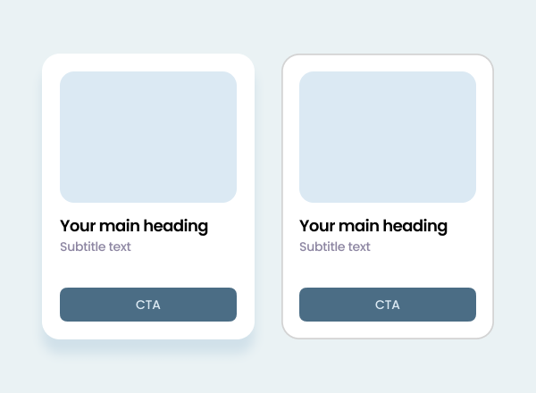
You can always use Multiple Drop Shadows, or a very subtle border (just a shade or two darker than your actual shadow) with certain elements in order to make those elements appear a little sharper, extra defined, and they also help avoid those muddy shadows.
2- Emojis and Icons Are Your Best Friends
The inclusion of emojis and icons will help you to explain the elements' functions in one glance - without even doing much. For examples - having a magnifying glass icon with the 'Search' button helps the user to know immediately that clicking on that button will help them find what they're looking for without much of a hassle. Not bad, isn't it?
But make sure you don’t over-do it. And only use those emojis or icons which have a global meaning.
3- Shoot Some Life In Your Copies
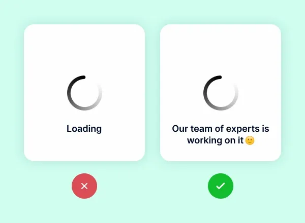
One of the simplest examples of this which we can give to ya’ll is - whenever any page is ‘Loading’ on your website, so instead of just writing “Loading” there, you can use something like “Our team of experts is working on it”. Not just it makes your UI elements less dull, they provide your users with a subtle sense of entertainment as well.
Good copies don’t necessarily have to be witty or humorous, but all they have to be is engaging & worth-a-read,
4- Illustrations Make Your Content Friendly & Familiar

If you want to showcase your complex ideas or words in the simplest terms possible - use Illustrations. This is because, since we were children, we have been taught & trained to link visuals to words and ideas. Have you ever seen a book for children that has no illustrations? What a terrible book it would be.
Including illustrations on your UI can help make your app or website look simple, yet very friendly or familiar for the users. An image will grab the imagination of a potential customer and make the aspects of your platform much easier to comprehend.
5- Using High-Quality Images improves The Overall User Experience
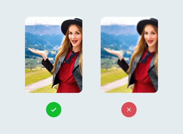
The imagery which you use in or on your platforms shouldn’t be taken for granted at all as they are just as important as any other visual element on your platform. They enhance the overall visual presentation of your platform - making it look much more lively and vibrant.
6- DARK MODE IS A MUST! OKAY?
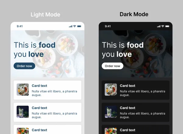
Believe it or not, but the dark mode was one the most hyped & much-awaited features of both iOS 13 and Android 10 last year. And well, it was loved by all the users on both the platforms. For people who use their phones in the dark, the Dark Mode is a solace, it’s easy on the eyes & makes your phone look less like a light bulb at night. Moreover, it saved a lot of juice on your phone as well.
But make sure you are giving them the ability to toggle between both - the dark and light modes.
7- Give Users an Unforgettable Experience
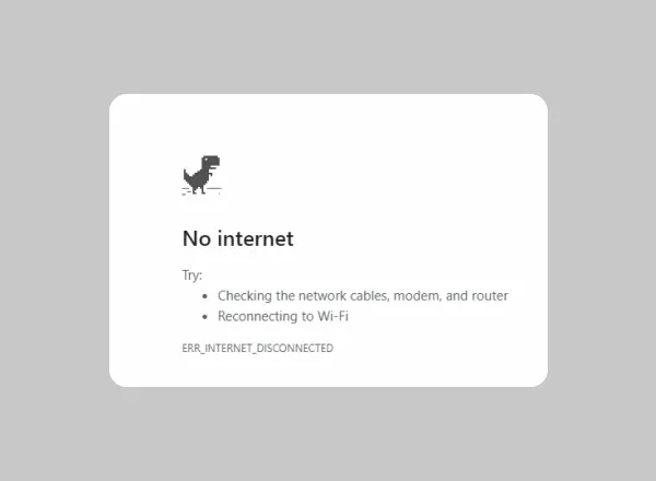
See every case, including the not so exciting, in your application as an opportunity to give your users an unforgettable experience. For example, error states are usually bad experiences, but by adding a bit of personality or aspect of enjoyment, you can turn them into pleasant experiences.
Our favourite example is the “no internet” error screen by Google Chrome. The way they provide all the information about how to fix it, along with the T-Rex game is a completely genius move.
8- Don’t Ignore The Micro Interactions
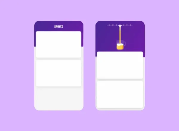
Micro-interactions give users small sensations that are not expected but enjoyed like animation. They can imitate real-life experiences in your application and provide user actions with instant feedback.
9- Add Some Motion To Your Design
In the design process, motion is quickly becoming more and more integrated nowadays. The thing about motion is - it is highly dynamic and can add life into anything and everything. To start with, with the right editing - motion can take the form of an illustration you want, you can animate the way you want to or make it interact with any other element on your page. Also, consumers believe that the interactions on their computer will be similar to what they see in the real world.
Just like the illustrations, the motions also serve the purpose of enriching the user experience of your customers. So, don’t overdo it - because the goal is to improve the experience and not to distract your users!
10- Patterns & Gradients Are The New Trends, Try Them!
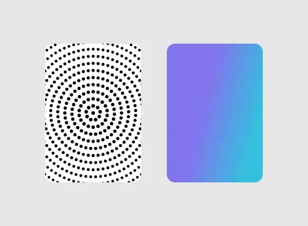
Patterns and gradients are another perfect way to make unattractive content more aesthetically desirable. The application of basic patterns and gradients to pictures or backgrounds brings charm and colour to uninterrupted designs otherwise.
With them, you can be as creative or as minimal as you want - just keep in mind that they don't end up coming out distracted.
Okay, So you’ve nailed the basics!
Now you can go forth and create beautiful, usable and effective designs & win your users over!
Goodluck.

