Minimalism in mobile app design is the ultimate form of 'less is more’ - except for user satisfaction.
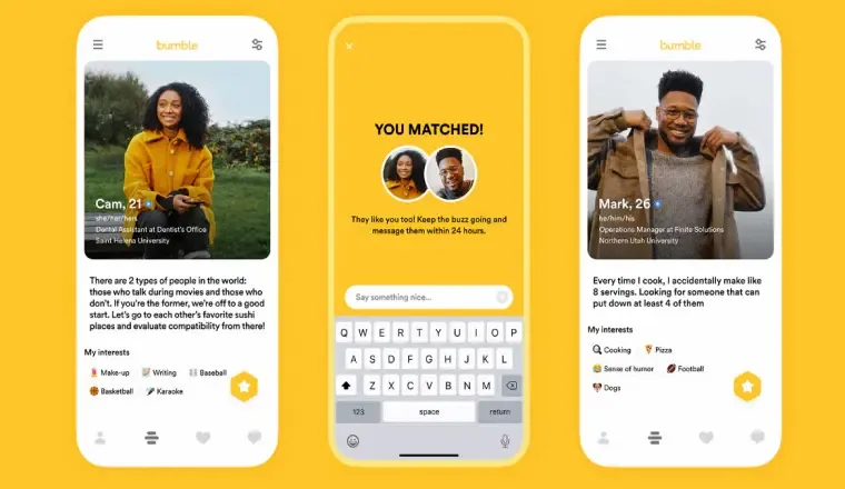
What makes dating app Bumble so popular among millennials and Gen Zs?
Minimalism. Yes that is it.
Too many apps these days are making things complicated for the user. Bumble came up with a different, simple and convenient UX and hit the jackpot in terms of installs and active users.
- Minimalism is visually appealing.
- It reduces clutter and enhances the functionality.
Let's understand what we mean by minimalist design.
What is a minimalist design?
It's just a sleek and functional design that makes using the app a breeze.
By playing around with typography, color, and negative space, designers create an immersive experience that lets users focus on what's important.
Discover the essence of minimalist design with Peter Allinson, Head of Design at UKTV. Dive deep into the philosophy of simplicity, explore captivating color palettes, and uncover the principles that drive minimalist aesthetics. Join us for an insightful session on how minimalist design can transform your space and mindset.
Benefits of a minimal app design:
It provides cognitive tranquillity
Minimalist interfaces have been shown to provide cognitive tranquillity by reducing the cognitive load and minimising the potential for user frustration. Studies have found that a clean and uncluttered design can create a sense of calm and improve overall user satisfaction.
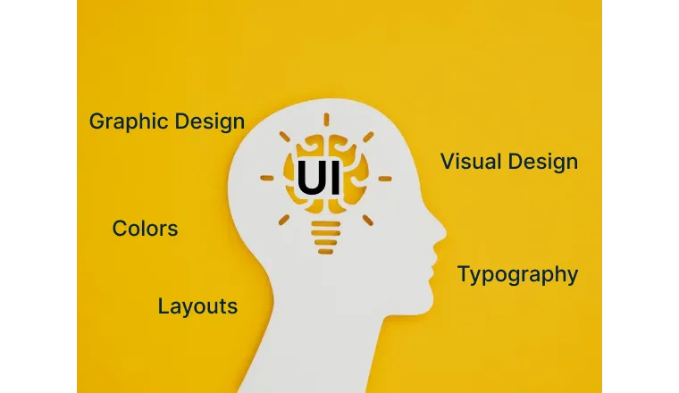
An Effective Call to Action
A direct call to action is achieved through a minimalist design. Simplify the interface for a user to focus on essential elements and increase emphasis effectiveness.
Improving Interface Responsiveness
Improve responsiveness by ensuring compatibility with various devices and minimising unnecessary components for a simpler design.
Increased User Retention
A minimalist app design boosts brand value by increasing user engagement and retention, leading to brand loyalty.
Boosting App Performance
The speed and reliability of an app are critical factors. Developers can significantly improve its performance by streamlining the app's design and removing redundant components, which results in zero app crashes.
This, in turn, translates to a better user experience and higher user retention rates.
Designing with Less: Key Elements for Effective Minimalist App Design
Leverage typography for effective communication in design
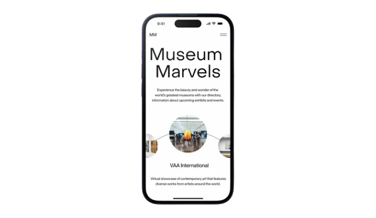
Typography is crucial for a minimalist mobile app design, creating a clean interface. Simple fonts, white space, and correct sizes and colors guide attention and emphasise essential elements, making it easy to use.
Enhance your design with the right color palette
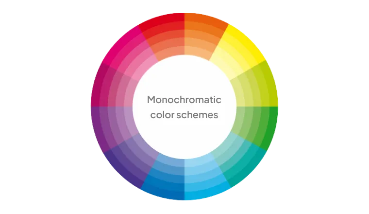
A minimalist mobile app design uses colors deliberately and strategically to create a clean, calming interface. Neutral tones or monochromatic shades with pops of color highlight essential information and direct attention effectively.
Enhance the visual appeal with Iconography
By conveying information efficiently and using less space than text, icons reduce visual clutter and create a streamlined interface. They also add personality and style, making the app more visually appealing and engaging.
How can designers achieve the perfect balance between functionality and aesthetics in minimalist app design?
Minimalist app design prioritizes functionality and aesthetics by focusing on user experience, consistency, and simplicity. Achieving this balance requires technical expertise in coding, prototyping, user testing, and feedback analysis from a skilled team of developers, UX designers, and product managers.
Mastering Minimalism: Analyzing Successful Minimalist App Designs
Minimalist apps can be highly effective, providing a seamless, intuitive experience that allows users to accomplish their goals quickly. These successful examples of minimalist app designs showcase the power of simplicity, clarity, and functionality in creating aesthetically pleasing and practical apps.
- ZARA
- CRED
- Bumble
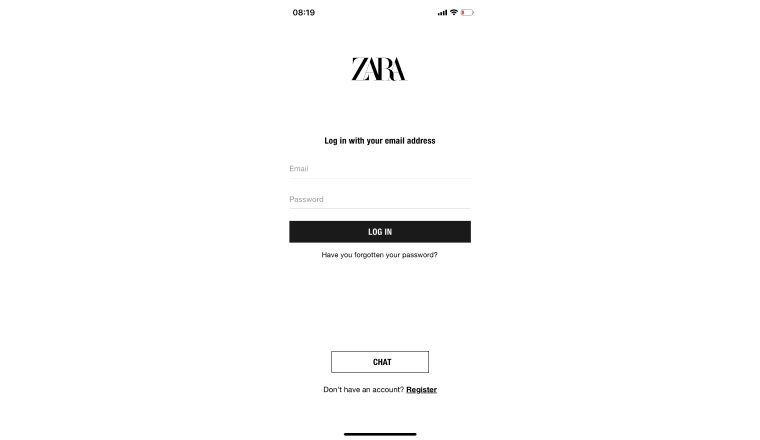
The login page features a minimalist design with a white background, black text, essential login elements, email and password fields, and a 'forgot password' link.
This minimalist design enhances user experience, providing straightforward access with one-tap login options through Google and Facebook. No unnecessary graphics or distractions.
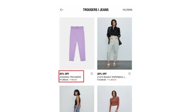
The Zara app's product listing page is designed minimally with a clean, straightforward layout that lets users browse products easily.
Using white space, simple fonts, and minimalist icons gives the page a modern and elegant feel, allowing users to focus on the products and making the shopping experience more enjoyable.
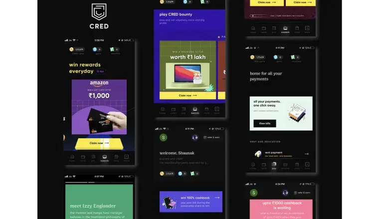
Cred’s design is simple, uncluttered, and user-friendly and uses neumorphism, a popular interface design trend.
The app uses real-life object elements that are balanced to create a connection with the background, including subtle micro-interactions, to keep users engaged.
These animations are visible on the splash screen and at various points within the app, such as when clicking on the money button.
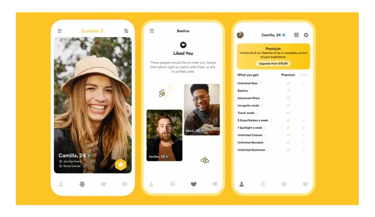
Bumble's minimalist design emphasises on essential features with a muted color palette, simple icons, and a straightforward layout. This approach reduces distractions, allowing users to establish potential matches and connections quickly.
The app offers onboarding that is streamlined and user-friendly and supports all functionalities for uploading photos and files.
What is the future of minimalist design trends in mobile app development?
A clean and uncomplicated interface that reduces distractions and facilitates easy navigation is the hallmark of minimalist design. According to Adobe's report, the use of minimalist design in mobile apps has grown by 147% since 2016, with 44% of designers choosing it for app interfaces.
In conclusion, a minimalist design is a versatile approach, suitable for various app industries, with the ability to cater to specific target audiences. Its benefits extend beyond improved user experience, including cost reduction and app performance.
Minimalist design's future in mobile app development appears promising, and its popularity will likely continue due to its elegant and straightforward user interface.
Frequently Asked Questions on Minimalism in Mobile App Design
Question 1: Is minimalist design suitable for all types of mobile apps?
Ans: While the minimalist design is versatile, its suitability depends on the app's purpose and target audience. Certain industries may benefit more from this design approach.
Question 2: Can a minimalist design be dynamic and engaging for users?
Ans: Yes, minimalist designs can be dynamic through subtle animations and interactions, as demonstrated in Cred's neuromorphic design, providing engagement without compromising simplicity.
Question 3: Are there any potential drawbacks or limitations to minimalist app design?
Ans: While the minimalist design has numerous benefits, potential drawbacks may include the risk of oversimplification and the challenge of conveying complex information in a minimalist interface. Designers need to strike the right balance.

