Imagine you're having a cosy coffee on a chilly winter day. As you approach the counter to place your order, you notice the sleek, modern design of the digital menu displayed on a tablet. The buttons and icons are simple and minimalist, with a flat, matte finish.
However, as you reach for your steaming cup of coffee, you can't help but notice the mug's handle has a textured, curved design that mimics the shape and feel of a traditional ceramic mug.
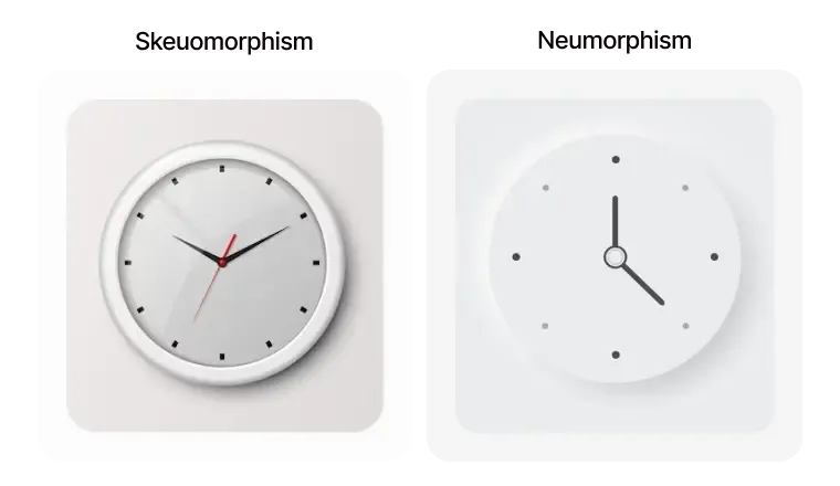
This scenario perfectly captures the ongoing debate between two design styles: Neumorphism vs Skeuomorphism. Neumorphism is a modern design trend that utilises soft shadows and gradients to create the illusion of depth and realism. On the other hand, Skeuomorphism is a design style that imitates real-world textures and materials to make digital objects look and feel more familiar.
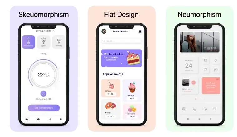
Now, let's dive into a deeper understanding of Neumorphism and Skeuomorphism.
Taking A Closer Look at the Neumorphic Design Trend
Neumorphism is a design trend that emerged in 2020, characterised by a minimalistic, soft, and almost three-dimensional look that imitates the physical properties of real-world objects. The term "Neumorphism" is derived from the words "New" and "Skeuomorphism”.
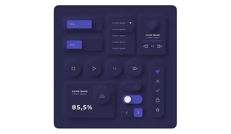
One of the most prominent examples of neumorphism in action is Apple's iOS 14 update, which included neumorphic design elements in the user interface of some of its built-in apps.
The update included the calendar and clock app icons, which featured soft shadows and subtle gradients to create a tactile and three-dimensional appearance.
The neumorphic design of the icons has been well-received by Apple users and design enthusiasts alike. The soft, pillowy texture of the icons creates a sense of familiarity and comfort, while the subtle shadows and gradients add a modern and minimalist touch.
Elevate Your Project with a Signature Style
Dive deep into Neumorphism and Skeuomorphism with us. Find your design voice – Schedule a Call Today!
Why Neumorphism Isn't Always the Answer: Drawbacks to Keep in Mind
- Accessibility Challenges: Neumorphism's low contrast and minimal colour scheme can pose difficulties for visually impaired or colour-blind users.
- Increased Complexity: Neumorphism's attention to detail requires more time and resources to implement, potentially increasing costs and complexity.
- Limited Applicability: Neumorphism may not be suitable for all design contexts, potentially creating confusion or distraction.
- Interactivity Implementation Issues: Implementing interactive elements, such as buttons or sliders, can be challenging in Neumorphism due to the need for visual differentiation.
Skeuomorphism: The Nostalgic Design Trend That Won't Die
Skeuomorphism is a design concept that uses decorative elements or design features that mimic real-life objects or materials that were once used in older or traditional designs, despite no longer being necessary or relevant in the current design. It is an approach that seeks to make new or modern designs appear familiar, comfortable, and understandable by using references to more traditional, physical materials and objects.
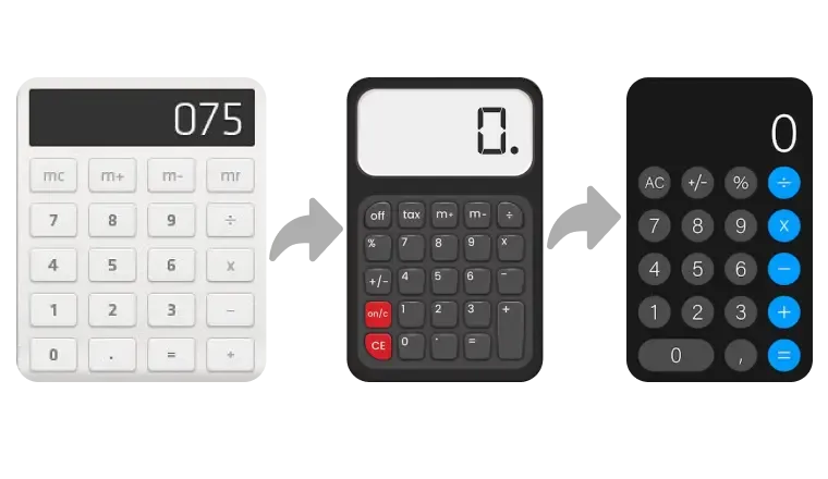
A perfect example of skeuomorphism in action is the design of the podcast app Overcast. Overcast uses skeuomorphic design elements to create a user interface that mimics the experience of listening to traditional radio.
The app includes skeuomorphic design elements, such as virtual tuning bars representing the volume level and a virtual antenna displaying the signal's quality. These design elements are intended to make the podcast listening experience more familiar and intuitive for users accustomed to traditional radio technology.
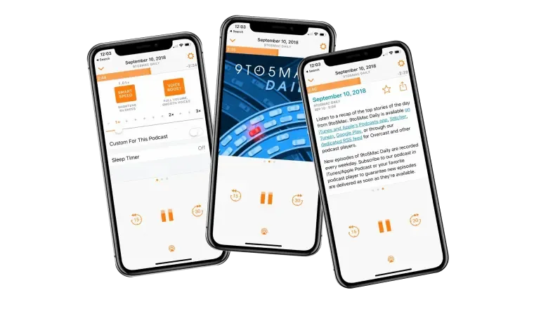
While some users appreciate the familiar and approachable design of Overcast, others have criticised the app's skeuomorphic design elements as being unnecessary and potentially distracting from the functionality of the app. Nonetheless, Overcast's skeuomorphic design illustrates how this approach can create a unique and engaging user interface in a media app.
The Drawbacks of Skeuomorphism: A Critical Look at Traditional Design
Less innovative: Skeuomorphic designs may limit designers from exploring more creative design solutions as they rely on replicating physical objects.
Less adaptable: Skeuomorphic designs may not be as flexible to different screen sizes and resolutions as minimalistic designs.
Distracting: Skeuomorphic designs may sometimes focus too much on aesthetics and distract from the interface's functionality.
Outdated: Skeuomorphic designs can become obsolete and feel old-fashioned, negatively impacting the user experience.
The Debate: Neumorphism vs. Skeuomorphism - Which is Better?
Skeuomorphism is easier to understand
It uses design elements that mimic real-life objects or materials, making them familiar and intuitive to users already familiar with the physical world. By referencing more traditional physical materials and objects, skeuomorphic design helps users understand the function of digital interfaces more easily.
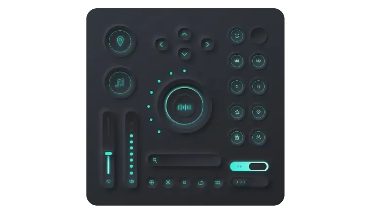
High end but lacks contrast
Neumorphism can create a high-end, luxurious feel that can appeal to users who appreciate a more sophisticated, refined design aesthetic. However, neumorphic design can lack contrast, making it more difficult for users to distinguish between design elements or interact with the interface quickly. Using low-contrast colours and soft shadows can make differentiating between other interface areas harder, especially for visually impaired users.
Skeuomorphic is More Accessible and Intuitive
Skeuomorphic design can make digital interfaces more accessible to a broader range of users, including those who may not be familiar with modern technology or have visual or cognitive impairments. Using familiar design elements can help users better understand the function and purpose of different design elements, making navigating and interacting with the interface more accessible.
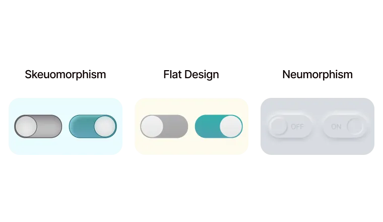
Choosing Between Neumorphism and Skeuomorphism: Finding the Right Design Approach
It is important to note that both neumorphism and skeuomorphism have their strengths and weaknesses. Neumorphism is a more modern design approach that can create a sleek and high-end look but may lack contrast and accessibility. On the other hand, Skeuomorphism uses familiar design elements that can create a sense of comfort and playfulness for users, but it may not be suitable for all design contexts.
Ultimately, the choice between neumorphism vs skeuomorphism will depend on the specific needs and goals of the project, as well as the preferences and expectations of the target audience. It is essential to consider the benefits and drawbacks of each design approach carefully and to listen to user feedback to ensure that the design choice meets the needs and expectations of the target audience.
In conclusion, the key is to choose the design approach that best aligns with the brand image and the user's expectations, ensuring a satisfying and engaging experience for all.

