Imagine you visit a restaurant to have noodles….
You have two choices - either eat with a spoon or a fork.
Fork is your choice, isn’t it!
How a simple tweak (shape) in the medium (spoon vs fork) of eating glorifies the user experience :)
Let’s take a look at another one:
Illustration below depicts different designs of ketchup bottles and understand which functions with more ease and why.
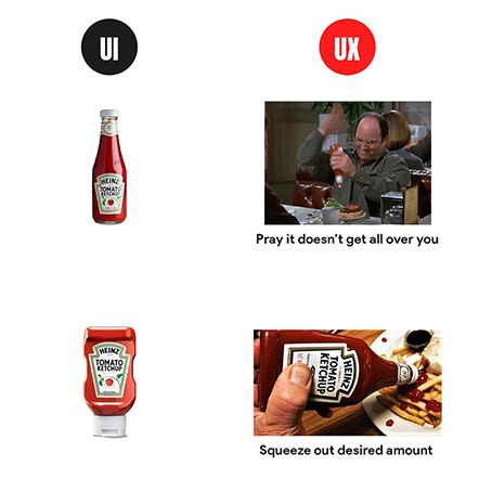
These examples provide a basic understanding of the two terms UI and UX.
UI is the visual appeal & design of the product, UX is focused more on the user experience & interaction with the product.
First things first, to understand both of them let’s break them down further.
What really is UX? While the roles of UX and UI designers may appear similar, they are distinctly different. Dive into Paul Boag's insightful podcast to explore these differences in depth.
What is actually a UX design?
In layman’s terms, UX is short for user experience design.
Scientist Don Norman first tossed the term “user experience” in 1990’s and defines it as follows -
“User experience encompasses all aspects of the end-user's interaction with the company, its services, and its products.”
It focuses on the user experience when they interact with your product and to make the product more intuitive for the users.
Within a mobile app development company, or any company for that matter, a UX specialist works with the whole team of UI designer, researcher, marketers & others to gain better insights and improve experiences.
What is a UI design?
UI or user interface design is a much more practiced field and yet the question of ‘what’ remains.
While, UX is more focused on making the user experience more effective and seamless, focuses on the interactivity and visual appeal of a product.
As people usually get confused between the two. User interface is a point of interaction between the user and the product, for instance- like a touchscreen of your smartphone.
A UI designer has to ensure every aspect, visual and interactive to make the product intuitive. Color schemes, spacing, design, buttons etc play a major role.
How do they differ from each other and yet go hand-in-hand?
As rightly summed up by Don Norman and Jakob Nielen:
“It’s important to distinguish the total user experience from the user interface (UI), even though the UI is obviously an extremely important part of the design. As an example, consider a website with movie reviews. Even if the UI for finding a film is perfect, the UX will be poor for a user who wants information about a small independent release if the underlying database only contains movies from the major studios.”
Google is the biggest example for how a great user experience looks like. It knows that the users want ‘information’ and it stands well on that expectation.
Google delivers every search in microseconds. What if took it 15 seconds? Will you still go back?
Here are the key points that we have jotted down for you:
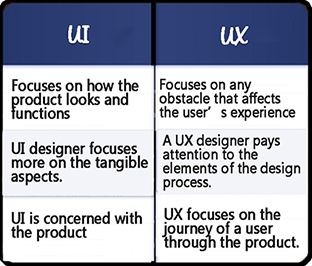
In the simplest form the two can be explained as: if you go to a restaurant, consider UI as the table, chair, glass, plates and furniture. And UX is everything right from the food to the ambience, service and parking.
Points to consider while implementing UI/UX design
You need to keep a few points in mind to acknowledge the implementation of the UI/UX design process.
Considering User Persona
It is important to have a deep understanding of the needs and demands of the target audience to create an exceptional product. The designers should ideate their products based on their theme and promotional messages.
Brand Language
The words and images a brand uses to define its theme, purpose and reference of the product is called its brand language. It's very important for the users to relate to the brand language.
For instance, Zara is known for simple yet chic fashion and its mobile depicts the exact same message. Every picture having a classy white background and a simple black text speaks the brand language.
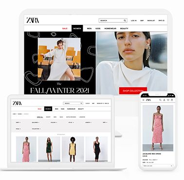
Wireframe Ergonomics
A wire frame is the layout demonstrating elements of the interface and it is the most critical part of the design process. It involves visualization of the skeleton for the applications.
Colors
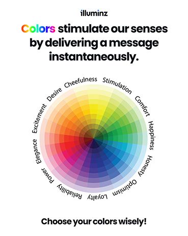
Right use of color can create a positive image for your customer and it also stimulates all the senses in the user by delivering a message like no other communication. Colors play a leading role, when it comes to designing.
CTA’s
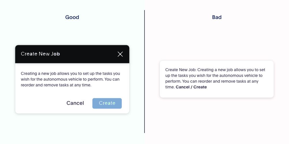
A call-to-action or a CTA focuses on inducing people so that they take certain actions that lead to conversion of a particular page or screen.
CTA buttons should be easy to notice so that people cannot resist clicking them.


How does UX experience enhance customer satisfaction than just a UI focused design?
UI and UX are like bread and butter. Although the bread comes first (in this case it's UI) but the butter (UX) is equally important to achieve satisfaction in eating.
If we compare the two - UX has an upper hand because it's easier to ignore a lousy UI, but a bad UX can’t be ignored.
A good UI might just look attractive in the visual sense but it's the good UX that helps solve the user’s problem and makes life easier.
What would you choose - something that looks great and is hard to use or something that is usable but looks simple?
This is the best example to explain how a good UX is better than a poor UI.
Ques 1: Is it possible to be an expert in both UI and UX design?
Ans 1: UI and UX are two distinct but equally important aspects of design. Yes, one can be an expert in both, and organizations always prefer a multiskilled designer who is best in both.
Ques 2: Which Tool is used by UI designers?
Ans 2: UI designer mostly used following tools:
- FIGMA, Adobe XD, Sketch(MAC OS) - Best UI design tool.
- Prototype - Best for Prototyping.
Ques 3: Which Tool is used by UX designers?
Ans 3: UX designer mostly used following tools:
- Mockflow: Provides all UX planning tools in a single suite that enables teams to visualize concepts, document styles, approve designs and more.
- Stories on board: Primarily used for story mapping solution.
- Balsamiq: Used for wireframing.
- Azure: best technical tool for UX designers.
- Miro: Best for card sorting.
- Smartlook: User behaviour and analytics.

