Ever wondered how the apps and websites you love start their journey?
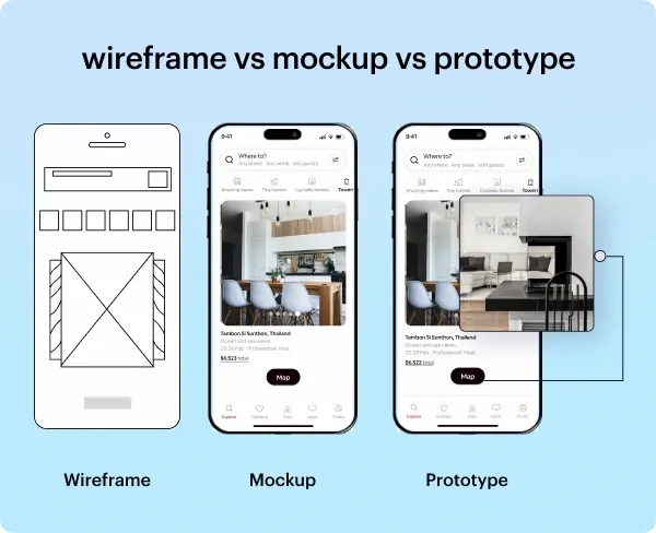
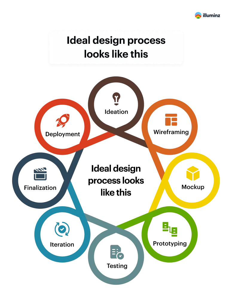
It's a fascinating story of 'wireframe vs mockup vs prototype.' These three steps are the backbone of every cool website and app you use. In this blog, we'll explore each of these stages.
We'll see how they take a simple idea and turn it into something great. Whether you're a tech enthusiast or just curious, let's dive in and uncover the magic behind your favorite digital experiences. Ready to see how a wireframe turns into a mockup and then a prototype? Let's get started!
What is Wireframe?
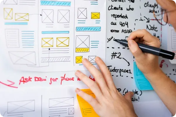
A wireframe is essentially a skeletal representation of a webpage, illustrating the key elements and their spatial relationships. This visual guide acts as a roadmap for designers and stakeholders, outlining the fundamental components that will exist on a given page. The inherent motto of a wireframe lies in its ability to offer a transparent visual understanding at the initial stages of a project, facilitating informed decision-making before the creative process unfolds.
Let's break down the features, advantages, and disadvantages of wireframes::
Features of Wireframes:
- Structural Blueprint: Wireframes serve as a fundamental layout, outlining the skeletal structure of a web page or application.
- Element Representation: Clearly illustrates the presence and placement of key elements like text, images, and interactive features.
- Early Design Stage: Wireframing takes place in the early phases of the project, providing a foundational framework for subsequent design iterations.
- Approval Facilitator: Acts as a visual guide to aid in obtaining early approvals from stakeholders before the creative phase commences.
- Early Visualization: Offers a clear visual understanding of the project at its nascent stage, minimizing misunderstandings later in the development process.
- Cost-Effective Iteration: Allows for cost-effective refinement and iteration of design concepts based on initial feedback. Making wire-frames on paper and pen is a lot easier than preparing a concept design.
- Streamlined Approval: Streamlines the approval process by focusing on essential design elements, reducing the risk of major revisions during later stages.
- Plan for Website Responsiveness: Wireframes help you in setting the site elements right. They make it easy to select the content that is most relevant to the website/application visitors plus, they give a clear picture of how different elements will look on different screens. You can easily track the flow of the project.
- Lack of Detail: Because wireframes are basic, they might not show all the detailed visual and interactive aspects present in the final product.
- Limited User Experience Representation: May not fully capture the user experience, requiring additional stages like mockups and prototypes for a more comprehensive understanding.
- Potential Misinterpretation: Stakeholders may misinterpret wireframes as final designs, leading to misaligned expectations.
- Inability to Simulate Interactivity: Wireframes often fall short in simulating the dynamic interactions and functionalities present in the completed product.
- Provide design limitations: Once the project's basic plans are approved, designers have little room for their creative ideas. Making changes beyond the agreed-upon plans might disrupt the flow, especially if the desired adjustments need a different layout.
- Visual Representation: Mockups provide a detailed visual representation of the final product, including colors, typography, and images.
- Static Design: They are static and non-interactive, focusing on the visual aspects without incorporating functionality.
- Final Design Elements: Mockups include many of the final design elements, giving stakeholders a realistic preview of the aesthetics.
- Intermediate Stage: Mockups serve as an intermediate stage in the design process, bridging the gap between wireframes and the final product.
- Visual Feedback: Stakeholders can provide feedback on the visual aspects of the design before development, reducing the need for major changes later.
- Cost-Efficient Iteration: Changes to the design are less costly at the mockup stage compared to later stages, making it a cost-efficient way to iterate and refine.
- Alignment of Expectations: Mockups help align stakeholders on the visual direction, minimizing misunderstandings during the development phase.
- Client Approval: They are effective tools for obtaining client or stakeholder approval, as they offer a clear and tangible representation of the final product.
- Lack of Interactivity: Mockups lack the interactive features of the final product, potentially leading to misunderstandings about the user experience.
- Time-Consuming: Creating detailed mockups can be time-consuming, especially if changes are required, which might affect project timelines.
- Not Fully Representative: Despite visual accuracy, mockups may not fully represent the dynamic nature of the final product, leading to some degree of uncertainty.
- Limited User Testing: As static representations, mockups may not be suitable for comprehensive user testing, which is better facilitated at the prototype stage.
- Interactivity: Prototypes are interactive models, allowing users to experience the flow and functionality of the product.
- Visual Representation: They provide a visual representation of the final product, often including design elements and user interfaces.
- User Feedback: Prototypes facilitate user testing, enabling designers to gather valuable feedback for refinement.
- Iteration: They support an iterative design process, allowing for changes and improvements based on user testing and stakeholder input.
- Communication Tool: Prototypes serve as effective communication tools, helping to convey design concepts and ideas to stakeholders.
- User-Centered Design: Prototypes promote user-centered design by allowing early testing and validation of design assumptions.
- Risk Reduction: Testing with prototypes helps identify potential issues early, reducing risks associated with the final product.
- Clear Visualization: Stakeholders get a clear visual of the product, fostering a better understanding of the outcome.
- Enhanced Collaboration: Prototypes encourage collaboration among design teams, developers, and stakeholders, leading to better-informed decisions.
- Time and Cost Efficiency: Catching and addressing issues early in the prototyping stage can save time and costs during the later development phases.
- Time-Consuming: Creating detailed prototypes can be time-consuming, especially for complex projects.
- Resource Intensive: Developing interactive prototypes may require more resources compared to other design stages.
- Overemphasis on Aesthetics: Prototypes may sometimes focus too much on visual aspects, neglecting certain functional details.
- Misinterpretation: Stakeholders might misconstrue a prototype as the final product, leading to potential misunderstandings.
- Limited Realism: Despite their interactive nature, prototypes may not fully replicate the real-world complexities of the final product.
- AI in Wireframes: Design Tools like Adobe XD and Balsamiq, AI is streamlining the foundation of design. It helps designers efficiently create layouts, ensuring a user-centric approach and design efficiency.
- AI in Mockups: AI leaves its mark on mockup creation in tools like Sketch and Figma. It optimizes visual elements and functionality, making mockups dynamic and reflective of the final product. This intelligent fusion elevates the design and functionality of mockups.
- AI in Prototypes: Leveraging tools like InVision and Proto.io, AI introduces advanced interactivity to prototypes. This transformative tool reshapes user experiences, providing designers with a more realistic and immersive preview of the final product.
- Basic layout and structure.
- Page elements and their placement.
- Navigation and user flow.
- Placeholder content and text.
- Calls-to-action and interactive elements.
- Annotations or notes for additional context.
Advantages of Wireframes:
Disadvantages of Wireframes:
What is Mockup?
A mockup is a high-fidelity visual representation or prototype of a design. It provides a detailed preview of how the final product will look, including specific elements such as colors, typography, and imagery.
Mockups are static and non-interactive, focusing on the visual aspects of the design. Designers often use mockups to showcase the aesthetics and layout of a website, application, or product to stakeholders or clients before the development phase. Mockups play a crucial role in refining the visual aspects of a design and gaining approval before moving forward with the implementation.
Certainly! Let's break down the features, advantages, and disadvantages of mockups:
Features of Mockups
Advantages of Mockups:
Disadvantages of Mockups:
What is Prototype?
A prototype is like a practice version of a product, giving designers and developers a chance to see how it works and looks. It's a model that lets everyone test and explore different features before creating the final product. This helps find out what works well and what needs improvement. The word "prototype" comes from Latin words - "proto" means original, and "typus" means form or model. So, a prototype is like the original model that helps shape the final product based on what we learn during testing and refining.
Features of Prototypes:
Advantages of Prototypes:
Disadvantages of Prototypes:
Key difference between Wireframe vs Mockup vs Prototype
| Aspect | Wireframe | Mockup | Prototype | ||||||||||||
| Purpose | Basic layout and structure. | Visual representation of the design. | Interactive simulation of the final product. | ||||||||||||
| Fidelity | Low-fidelity, minimal detail. | Medium to high-fidelity. | High-fidelity, often mimicking functionality. | ||||||||||||
| Interactivity | Non-interactive, static. | Limited interactivity, if any. | Interactive, simulating user experience. | ||||||||||||
| Detail Level | Focuses on structure and placement. | Includes colors, typography, and visuals. | Incorporates detailed visual and functional aspects. | ||||||||||||
| Timing in Process | Early stage, before design refinement. | Intermediate stage, after wireframing. | Later stage, after mockups, closer to development. | ||||||||||||
| Feedback Gathering | Feedback on layout and structure. | Visual and aesthetic feedback. | Comprehensive feedback, including functionality. | ||||||||||||
| Tools Used | Simple tools like pencil and paper. | Graphic design software (e.g., Photoshop). | Prototyping tools (e.g., Figma, Sketch). |
How AI Impacts Wireframe vs Mockup vs Prototype
Conclusion
To wrap things up, wireframes, mockups, and prototypes are key in making apps and websites. They each have a special role in turning ideas into something we can use and enjoy. With AI helping out, these steps are getting even better, leading to more creative and accurate designs. So, every time we use an app or website, it's exciting to think about how these tools are shaping the future of how we interact with technology.
Frequently Asked Questions on Wireframes vs Mockups vs Prototypes
Question 1: What tools are commonly used for creating mockups in UX design?
Answer 1: Commonly used tools for creating mockups in UX design include Adobe XD, Sketch, Figma, InVision, Balsamiq, and Axure. These tools offer a range of features for designing and visualizing user interfaces before the final development phase.
Question 2: What are the key components typically included in a UX design wireframe?
Answer 2: In a UX design wireframe, the key components are

